Spendflo Demo Environment
Turned Spendflo's existing Figma designs into a reliable, scenario-driven demo environment using Claude Code, cutting Sales' dependency on Dev and an unstable shared demo setup.
- Role
- Product Designer
- Timeline
- 1 week
- Tools
Context
A demo environment Sales couldn't rely on.
Spendflo's Sales team uses a demo environment to walk prospects through the product on customer calls. It was shared, unstable, and entirely Dev-controlled: any dataset change, scenario, or reset meant going back to Dev, right when reliability mattered most.
The Problem
Sales had no control over the thing they relied on most.
- 01
- Demos could fail mid-session on live calls.
- 02
- Dataset changes and resets needed Dev involvement.
- 03
- One static setup couldn't serve different customer narratives.
- 04
- Sales had no way to configure or trust what the demo showed.
Planning
Plan the system, then the screens.
01. Design system before screens
Figma designs already existed, so the first task was turning them into a controllable product using Claude Code: Figma MCP for design access, extracted design tokens, then a component library, pattern library, and written guidelines, all before any screen work began.
# Design Guidelines A shared reference for layout decisions, spacing conventions, and component usage. These rules apply across all screens and should be treated as non-negotiable constraints during implementation and design review. --- ## Layout ### Button SpacingAdjacent buttons must have **8px** of space between them. This applies to all button groups: primary/secondary pairs, icon buttons in a toolbar, and inline action clusters. ```[ Primary Action ] ←8px→ [ Secondary Action ]``` Do not use larger gaps (e.g. 12px or 16px) between buttons just because surrounding whitespace feels loose. Button proximity signals that actions belong to the same context. ### Below Top NavigationAlways leave a **16px gap** between the bottom edge of the top nav and the first content element on the page. This applies whether the first element is a page header, a filter bar, a table, a card, or any other component. ```┌────────────────────────────────────┐│ Top Navigation │└────────────────────────────────────┘ ↕ 16px┌────────────────────────────────────┐│ First Content Element │``` Do not collapse this gap for "compact" views unless a layout token explicitly defines a smaller page offset for that context. ### TablesTables are always **edge to edge**: they span the full width of their containing layout column, reaching both the left and right edges with no horizontal padding or margin on either side. ```|←------- Full container width -------→|┌─────────────────────────────────────┐│ Col A │ Col B │ Col C │├────────────┼───────────┼────────────┤│ │ │ │└─────────────────────────────────────┘``` - The table component itself must use `width: 100%` so it fills its container on both sides.- At least one column must be left without a fixed pixel width so it can flex and absorb remaining space, preventing a gap on the right edge when the container is wider than the sum of fixed column widths.- Padding lives inside the table cells, not outside the table. If a table appears inside a card or panel, the table must bleed to the card's inner edges , remove any wrapper padding that would otherwise indent it. ### Table HeaderAlways use the **filled table-header variant**: the header row carries a `--surface-strong` background, never a transparent one. This visually separates the header from the body rows on every table. - Use the `DataTable` header variant whose background is `var(--surface-strong)`. Do not ship a table with a transparent / unfilled header.- The fill is `--surface-strong` specifically, not `--surface-subtle` or any other surface token. --- ## Components and Patterns ### Build Every Screen From the Package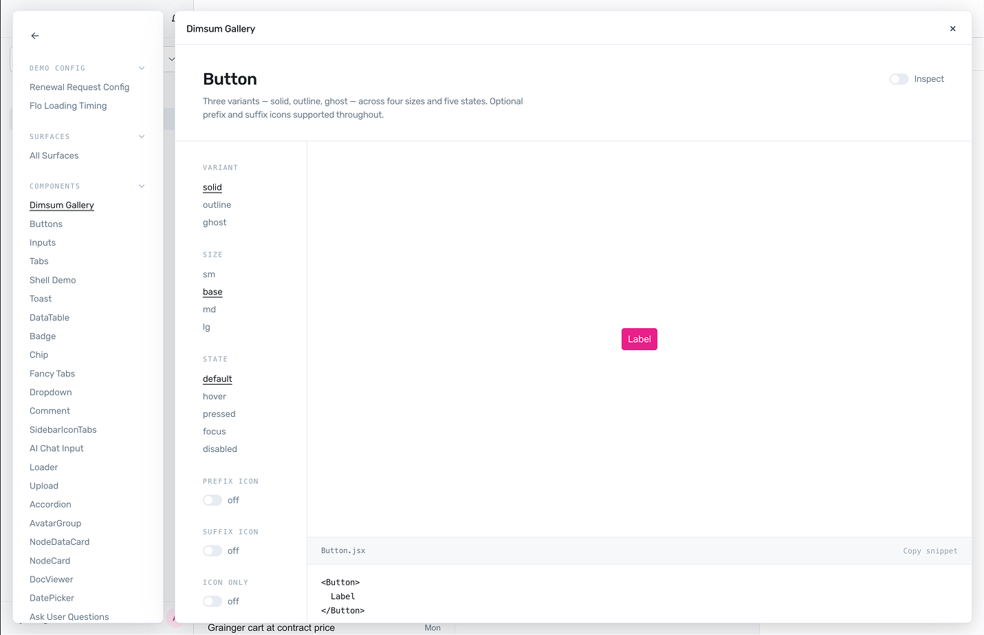
02. Single base platform, multiple scenarios
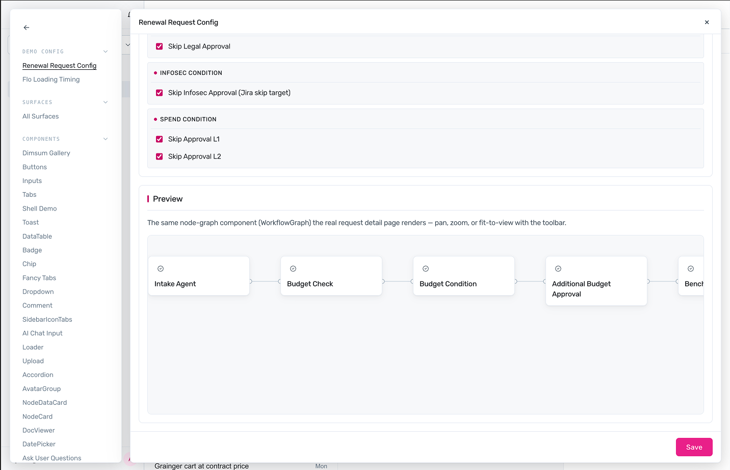
Mocked surfaces, step-by-step scripts and keyboard shortcuts let Sales switch quickly across tools and flows mid-demo, without Dev.
03. What's real vs. simulated
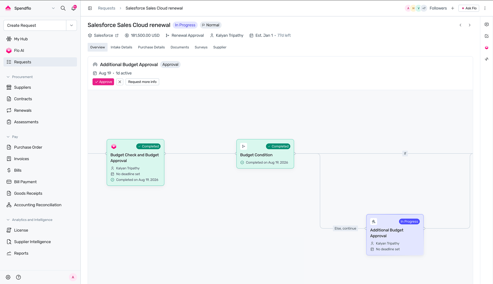
Demo fidelity, not backend parity. UI, design system, and components were recreated in full; navigation and interactions were implemented; dataset, backend, and integrations were simulated; demo scenarios stayed configurable throughout.
Migrating Design to Claude
Building screen by screen.
With the system in place, each screen followed the same five-step loop rather than a one-off build; the repetition is what kept output consistent as the screen count grew.
Point Claude
To the design reference, system, and component guidelines.
Recreate
Ask Claude to recreate the screen.
Review
Manually, for visual accuracy and component usage.
Iterate
Correct, iterate, wire up scenario data.
Validate
Manually, before moving on.
Fixing the Gap in Handoff
Bridging the demo script and the build.
Even with the replica in place, the hand-off from Sales still had a gap.

Can you convert this prospect recording into a demo flow? Here's the Avoma link: app.avoma.com/meetings/prospect-call

Hey, I got you.
So I built demo-to-ui, a Claude Code skill that breaks a script or transcript into scenes, maps each to a screen, and builds the demo in Claude Code automatically.
---name: demo-script-to-uidescription: > Use this skill when a user shares a demo script, sales script, or product walkthrough alongside a codebase and wants it implemented. Triggers: "implement this demo", "build what's in this script", "turn this script into UI", or any time a script + codebase are both present.--- # Demo Script → UI **Rule: Understand the script → Confirm flows → Go scene by scene with user → Build all at end.** ## Steps **1. Inspect the codebase first.** Map components, states, interactions, patterns, and demo infrastructure. Also read `CLAUDE.md` for builder mode instructions. This is the source of truth. **2. Understand the script.** Read it fully and derive logical flows, including every optional, edge case, or conditional flow. Never omit a flow, never assume it's out of scope. Confirm the full interpretation with the user first: ```I see 4 flows in this script, including 1 optional:1. Exception Queue , user reviews a list of flagged invoices2. Invoice Detail , user opens an invoice and reviews AI findings3. Verdict Action , user approves, escalates, or disputes4. (Optional) Empty state , no invoices in the queue Does this look right? Should I include the optional flow?``` Once confirmed, go **scene by scene**. For each scene, present in the Claude interface: - The table row for that scene (user/system POV language)- A builder mode preview rendered in the app showing what that scene looks like **Never make a silent assumption.** If anything in the script is ambiguous: interaction, layout, content, state, or behaviour , stop and ask before proceeding. Example: ```The script mentions a "verdict badge" but doesn't specify placement.Where should it appear: on the invoice row, in the detail header, or both?``` Action language rules:- User actions: `User clicks X`, `User selects X`, `User types in X`- System responses: `System loads X`, `Page opens with X`, `X updates to show Y` Table format per scene: | # | Action | Where | Reference | Status ||---|---|---|---|---|| 1 | User clicks invoice row | Invoice list page | Row action in Bills page | ✅ Exists | **3. Build.** Once all scenes are confirmed, ask: _"All scenes confirmed. Ready to build everything into the app?"_ Only start building after the user says yes.After this, my process got even simpler:
Run the skill
demo-to-ui on the script or transcript.
Iterate
Refine the generated demo.
Push
Ship it for Sales to use.
Understanding Claude's Limitations
Token budget and where Claude fell short.
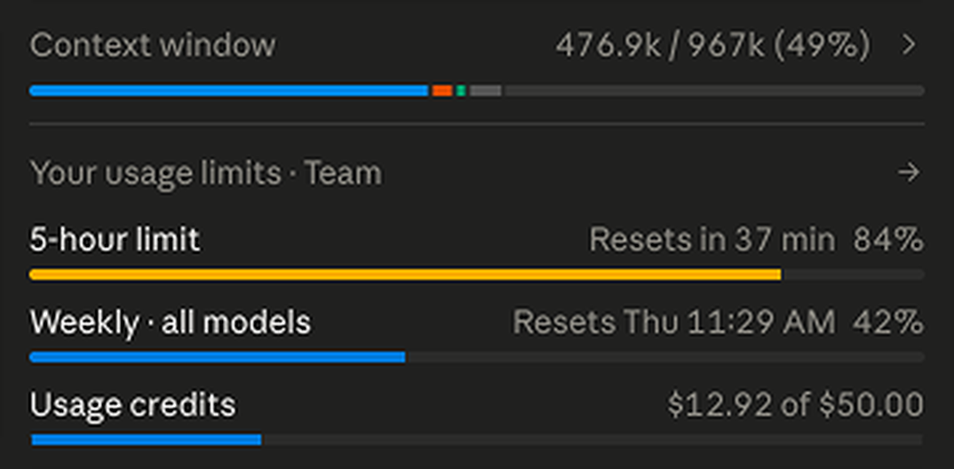
- Token efficiency
- A real constraint, so context management (/clear, /compact, /autocompact) became part of the workflow.
- Right context
- Give Claude the right context, not all of it.
- Standing rule
- Claude builds, I test and validate manually. Browser self-testing burns tokens without adding value.
Claude is better at extending an established system than inventing one. Giving it an existing component to vary beats asking it to start from scratch.
Compliance Agent
Keeping the system self-improving.
As the codebase grew, drift from the component library got harder to catch. I built an agent that flags missed components, spots patterns worth formalizing, and audits implementation against guidelines: Claude builds, agent checks, guidelines update, the next build is more consistent.
Claude builds
Code changes for the screen, opened as a PR.
Compliance Agent audits
Checks the PR against the component library and written guidelines.
Ship or flag
Clean PRs merge; drift is flagged for review.
Guidelines update
Flagged drift becomes a rule, so the next build starts more consistent.
One rule kept it clean: one change, one purpose, one PR.
Key Learnings
What this taught me about working with Claude.
- Prework has a high ROI: the design system paid for itself by screen three.
- System-first beats screen-first, every time.
- Bridging the handoff (demo-to-ui) cut correction cycles the most.
- Prompting under a token budget is an engineering skill, not a nicety.
- Claude extends an established system far better than it invents one.
- Prior engineering knowledge (Git, componentization) still matters.
Outcome
Where it stands.
Adding demo data, setting it up, and sanitizing it used to take a couple of days. Sales can now build the same demo themselves in about 30 minutes.