Rebuilding Spendflo's Library
Spendflo's Design Language System had drifted: duplicated components, inconsistent spacing, and no documented usage patterns. Led a full DLS revamp with a 2-person design team, cutting UI-related bug reports by 65%.
- Role
- Product Designer
- Timeline
- 3 weeks
- Tools
A throwback: built the traditional way, before Claude Code was the default move.
Overview
Why the DLS needed a revamp.
“I keep rebuilding the same patterns because I can't find one to reuse.”
 Designer
“I end up writing custom CSS for basic elements, so nothing quite matches.”
 Developer
“The product feels outdated, and it's not always clear what to do next.”
 Customer
“Every new screen makes the old DLS harder to maintain.”
 Me
When I started on Spendflo, its design system had inconsistent UI, duplicate components, and a style that varied page to page.
That drift is why the DLS needed a full revamp, not another patch.
My role
I led the revamp end to end, from audit to rollout, rebuilding the DLS on atomic design and coordinating design, devs, QA, and release.
My process
Six steps, from feedback to release.
Collect user feedback
Pulled scattered feedback into one place.
Audit all components
Listed every component, its usage, and issues.
Design
Built for scale, with usage patterns.
Stakeholder approval
Aligned with business on priorities.
Dev hand-off
Reviewed builds with devs as they shipped.
Post release UAT
Checked every instance in the product.
Challenges
The main challenges.
The hard part wasn't designing components, it was everything around them: taking stock of how they were really used, keeping pace with developers, and catching breakages after every release.
Auditing usage
With no central pattern, components had been tweaked all over the product.
Constant feedback
The loop with developers took more effort than designing the components.
Ongoing QA
After each release I checked the product for breakages and routed fixes.
Audit findings
The DLS had drifted from something usable.
The audit surfaced three buckets of work: new components, inconsistent components to standardise, and duplicates to remove.
Missing
Tabs, badges, accordions, and info banners.
Modals
~200 audited, 6 sizes in use.
Icons
Mixed fill and stroke, 3 stroke widths, 3 sizes.
Spacing
10px and 14px in use, off the 4x scale.
Illustrations
Outside the DLS, with no set style.
Usage patterns
Undocumented, so devs built them inconsistently.
Auto-layout
Only 20% of components used it.
Duplicates
3 near-identical search, filter, and dropdown variants.
User feedback
The same complaints, from every role.
Aggregated across qualitative feedback on functionalities and roles, the same handful of problems kept resurfacing, regardless of who was using the product or what they were using it for.
“
The dropdowns, buttons, and illustrations all feel outdated compared to other products I use.
 User (Finance Manager)
“
Nothing looks the same from screen to screen, even the spacing feels off.
 User (Procurement Lead)
“
I never know if my click actually registered. It just feels buggy.
 User (Accountant)
“
Every module has its own version of a dropdown. It's confusing to relearn each time.
 User (CFO)
“
Some parts of the app just feel unfinished, like they were never really designed.
 User (Finance Analyst)
Rebuild
Rebuilding the basics, then the components.
Based on user research and audit findings, the plan was to rebuild the foundations first, then the components on top of them.
Rebuilt on an atomic framework
Before and after
| Before | After | |
|---|---|---|
| Colors | One base color, no defined scale | Full 50 to 950 scale for states, hierarchy, and accessibility |
| Fonts | 16px and 14px in use, undocumented | Both standardised and documented |
| Icons | Mixed icon sets | Tabler icons |
| Spacing | Ad-hoc values | A 4x scale |
| Modals | 6 different sizes in use | 3 layouts: 512px, 960px, and fullscreen |
| Banners, badges, tags, chips | Used but never defined | Added to the DLS |
| Controls, tabs, inputs | Partly documented | Standardised and documented |
| Auto layout | Used by 20% of components | Used by 90%, with variables on top of existing styles |
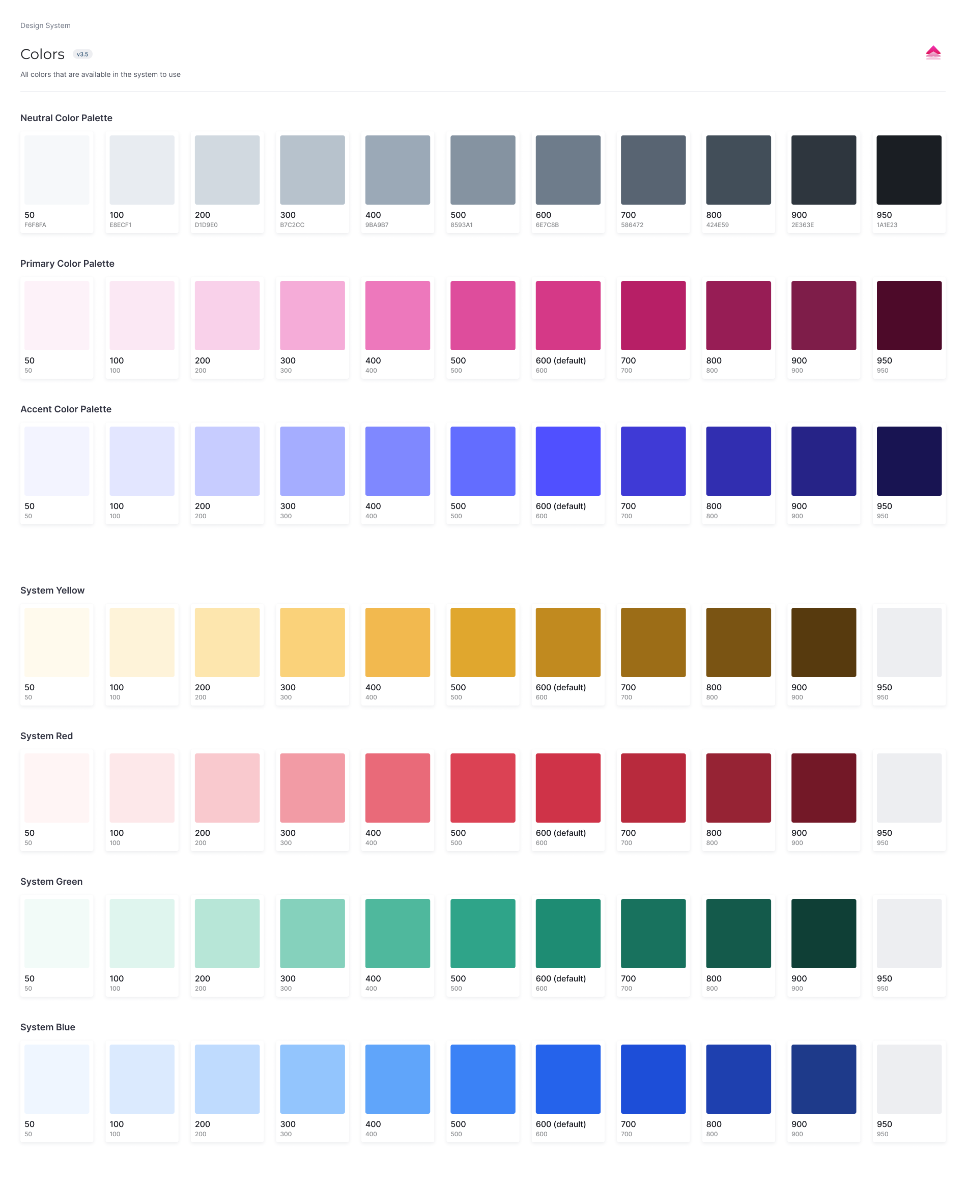
Documentation
Documented patterns, unified experiences.
Every component was audited and documented directly in Figma, shipping with usage guidelines, interaction behavior, and a single unified style for illustrations and loaders.
Components / Atom
Button
v4.0Component description and usage guidance.
Behavior across states and interactions.
Definition
2What the component is and when to reach for it.
Usage pattern
3- 1
Component name
The name and a short description.
- 2
Definition
What it is, and when to reach for it.
- 3
Usage pattern
Documented tags for where it belongs.
Hand-off
From design library to shipped product.
Shared the audit
Full audit list shared upfront, so devs replaced components with confidence.
Walked through the library
New library and documentation style, explained end to end.
Published v3.5
Folded in dev feedback on naming, then shipped.
VQA on updated components
Verified nothing broke across the product.
VQA on new components
Interaction, spacing, and color checked in storybook and in-app.
Opened feedback channels
Announced org-wide for ongoing input.
Logged the v2 backlog
Deeper usage guidelines and better documentation layout.
Impact
What actually sped the design team up.
Auto layout
Components restructured themselves on content change, cutting manual rework on every screen.
Documentation
Usage guidance and states lived in one place, so designers stopped re-asking in Slack.
Findability
Consistent naming and file structure put the right component one search away.
Outcome
Fewer bugs, faster design, cleaner hand-offs.
Bugs related to UI-level elements went down in the bug report channel, a clear signal the new DLS had a real impact for users.
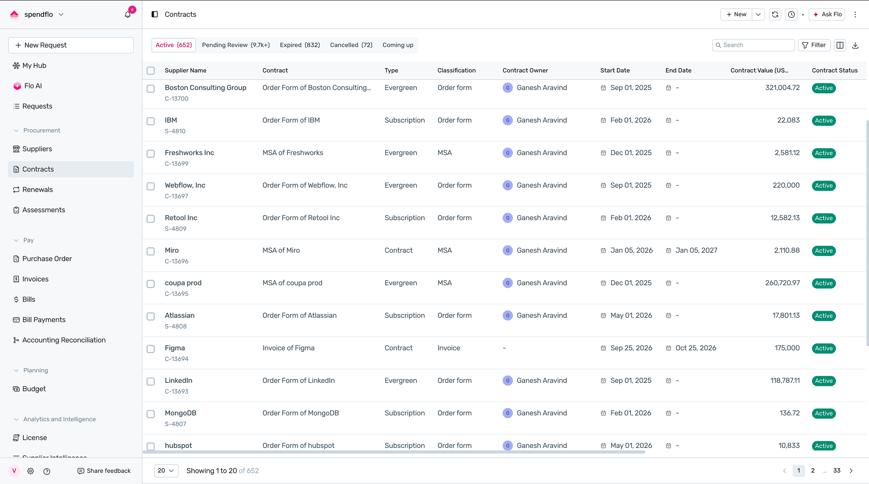
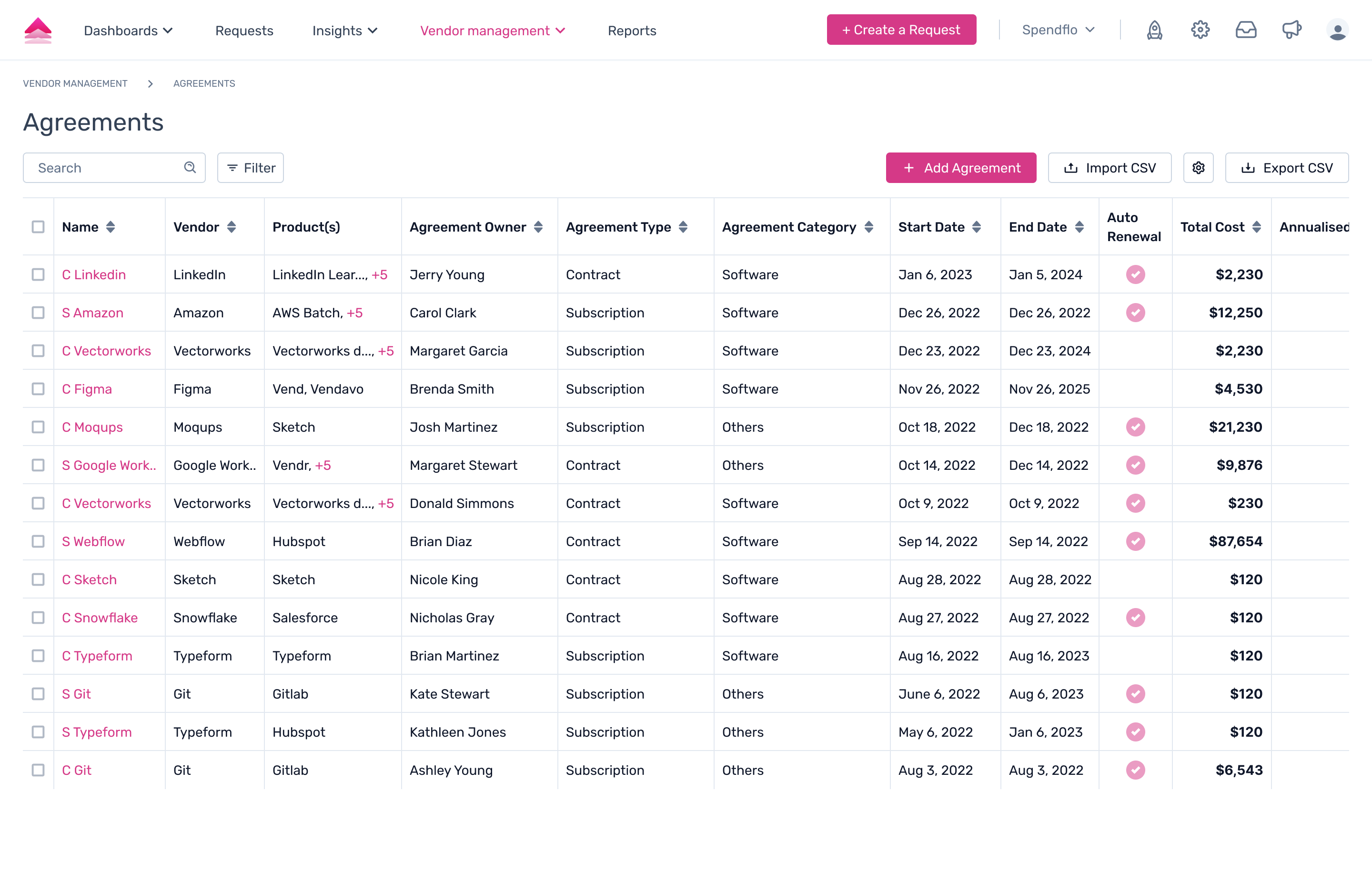
Before and after
The same page, old DLS and new.
 OldNew